One of the biggest, most important facets of branding is colour. Not only is it a foundation of good aesthetics, it also helps establish identity, convey emotions, and even set a mood.
For example, many fast food companies use red and yellow to communicate excitement and cravings. On the other hand, brands that focus on relaxation, freshness, nature, or freedom predominantly use green.
This simply means that you have to look beyond the logo when it comes to choosing colours. You also have to consider other elements of branding, including your physical store (if you have one) and your website. For the latter, it’s a good idea to hire web designers to ensure both a great layout and the best applications of colour.
If you don’t have a website yet or perhaps are thinking about rebranding, here are some key things to remember when picking a colour scheme:
Familiarise Yourself With Colour Philosophy
According to research, about 85% of consumers are influenced by colour when making purchases. What’s more, colour also boosts brand recognition by about 80%. These are considerable figures, which means you should choose colours wisely if you want to capitalise on them.
The best thing to do before you make a decision is to familiarise yourself with colour philosophy, regardless of whether you already have an existing logo or not. Different colours can mean a lot of different things, so you really need to be mindful. Some of the most common associations include the following:
- Black – elegance, authority, mystery
- Blue – stability, dependability, calmness
- Brown – earthiness, relatability, reliability
- Green – freshness, growth, harmony
- Orange – friendliness, cheerfulness, fun
- Purple – quality, luxury, ambition
- Red – energy, excitement, passion
- White – simplicity, possibility, goodness
- Yellow – happiness, optimism, positivity
This is just a quick glimpse of what colours can mean or symbolise. What’s more, there are also negative traits that can be associated with each colour. These include anger or aggression for red, and cowardice or deceit for yellow.
Pick a Main Colour
Once you know what the colours stand for, it’s time to choose the main colour of your website. If you already have a logo and/or other marketing materials, it’s common practice to anchor the website’s main colour on those. However, neutral colours such as beige, nude, sand, or even grey can work wonders for any brand or any colour of logo.
If you want, you can also ask your web design supplier for some suggestions. They can provide you with some swatches and mock-ups so you can visualise how everything will look like.
Decide on a Colour Scheme
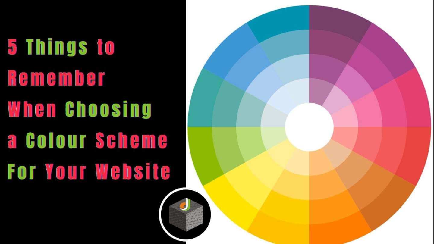
After choosing your main colour, the next step is to decide on a colour scheme. You have a variety to choose from, but the most popular are analogous, complementary, triadic, compound, and monochromatic.
The analogous colour scheme involves three side-by-side colours on the colour wheel. It’s composed of a dominant colour (the main colour you chose), a supporting colour, and an accent colour.
For something that lets the accent colour “pop” more, you can go with a complementary colour scheme. This is where you use two colours that are directly opposite each other in the colour wheel for a sharper contrast.
Something more extreme is the triadic scheme, which is composed of three colours that are evenly spaced in the colour wheel. The most basic example of this would be the three primary colours: red, blue, and yellow.
For a more subtle contrast, a compound colour scheme is ideal. Also called split complementary, this is a colour scheme comprising three colours: the main colour and two colours beside its complementary one.
Finally, monochromatic is a good choice if you want simplicity. It’s also easy to achieve a unified look with monochrome hues since all the tones are picked from the same colour.
Don’t Forget the Typeface Colour
When it comes to choosing the typeface or font colours on your website, don’t constrain yourself to black or white. In fact, there are few pure-black typefaces on the web simply because it will appear stark on the page. This can lead to eyestrain, not to mention shock, and can cause visitors to navigate away from your site.
If you’re partial to black, opt for grey or grey-tinted colours. This will help soften the starkness of balck. You should also consider a colour that’s already part of the pallette. For example, if you have a red and purple colour scheme, consider using purple for big fonts such as titles. White is also a good choice if you’re working with dark backgrounds.
Remember the Little Details
Finally, don’t forget to pick a colour for the little details in your website. These include the envelope and/or telephone for the “Contact Us” icon/s, text dividers, and even hyperlinked text. These small details can make or break the look of your website.
You should also think about the logos of social media sites that you link on your website. Will you retain Facebook’s blue and white icon or will you adjust the colour to match your website? You should also think about the colours of pop-up announcements for promotions and the like.
One last advice is this: don’t be afraid to explore the web if you need references. You can also ask for the opinion of your web designers. They’re there to ensure that you have a beautiful website and they’ll be more than happy to help.
Digital Web Services (DWS) is a leading IT company specializing in Software Development, Web Application Development, Website Designing, and Digital Marketing. Here are providing all kinds of services and solutions for the digital transformation of any business and website.


