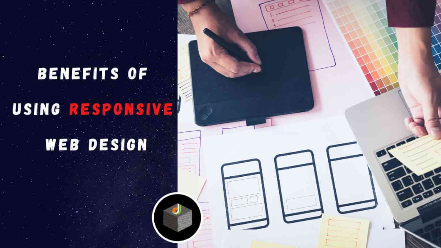
An increasing number of websites are becoming responsive to how users access them. This means that no matter what device they use, whether a smartphone, tablet, laptop, or desktop computer, the website will still work at its optimal functionality.
There is no need to modify anything. The site scales, so it fits the screen size of the user. Also known as “One Web” design, strictly using responsive web design (RWD) eliminates issues such as broken links and distorted images that occur when viewing one’s website on different devices.
For this reason, RWD has become increasingly common for businesses that want their customers to have full access to their site no matter the device they use.
As more businesses incorporate responsive web design into their website, software applications must follow suit. A recent trend in the industry has been to develop mobile solutions for scheduling hair appointments. This has created an inconvenience for barbers and customers alike and allows competitors of these companies immense opportunities for growth.
Because it is becoming more difficult for barbershops to operate without an online booking system, several new scheduling apps are being developed monthly.
However, some do not prioritise RWD as an absolute necessity, which puts these developers at risk of losing business if they cannot accommodate more users through different devices/platforms. The following article will provide a detailed guide on the importance of RWD and the ten benefits of using it in barber scheduling software.
What is Responsive Web Design?
A responsive web design allows one’s website to appear and function the same way no matter what device (smartphone, tablet, laptop, or desktop) or platform (iOS, Android) it is accessed from.
It uses techniques such as cascading style sheets (CSS), fluid grids, and media queries. Utilising these features ensures that users can view the entire website without having to scroll up and down or left and right across their entire screen. They may also zoom in/out if necessary.
Implementing these changes into your website will meet the growing demand for mobile accessibility and maintain a competitive edge in the industry.
The Importance of a Responsive Web Design in Barber Scheduling Software
As mentioned above, most users (barbers and customers) desire their scheduling software to be accessible from anywhere. This is made possible with responsive web design.
A great example of how crucial having RWD is, is when looking at a website and a booking app that currently does not have RWD implemented into their scheduling app. Meaning that both barbers and customers alike must view the website on their smartphone or tablet rather than what they are used to on a desktop computer or laptop.
This inconvenience will likely result in lost business as barbers and customers search for a more convenient way to book their appointments.
If your company has yet to make the switch, and the vast majority of businesses have realised the importance of RWD and how it affects their customer base, now is the time to do so.
Ten Benefits of a Responsive Web Design in Barber Scheduling Software
There are many benefits to implementing responsive web design into your barber scheduling software. Here are ten of them:
Increased User Convenience
As mentioned earlier, one of the main reasons responsive web design is important is because it allows customers to access your site no matter the device they use. If a customer wants to book an appointment at their barbershop, they will likely want to do so from their smartphone or tablet.
A non-responsive website fails to function correctly on mobile devices, leading to a lost business if enough users continually have difficulty accessing one’s site.
Increased Booking Efficiency
As more people become accustomed to using mobile devices rather than desktop computers, doing tasks such as setting up appointments through responsive web design becomes much more efficient.
This ensures that there are little or no barriers between what you intend for your customers/clients to accomplish (i.e., booking an appointment) and then accomplishing said task.
Improved Overall Website Functionality
By having a responsive web design, you can ensure that your website will be functioning the same way (no matter what device it is being accessed from) instead of having different websites for different devices/platforms, which can be very costly and time-consuming.
Increased Visibility and SEO Rankings
Due to the increased usage of mobile devices, a responsive website has become an essential aspect of any business’ online marketing campaign. When a website is designed responsively, it looks good on all devices and functions well. Search engines such as Google take both of these factors into consideration when ranking a website.
Reduced Development Time and Costs
Having a separate website for each device can be costly and time-consuming due to the different design and programming requirements. A responsive web design negates the need for such a development process, thus saving you time and money.
Easier Website Management
Managing your website’s content becomes much easier with a responsive website as it can be done from a single platform rather than separately for each website version. This also saves you time and money as you will not need to hire separate personnel to manage your website’s different versions.
More Engaging User Experiences
By providing an engaging user experience, you can keep customers on your website longer, leading to increased chances of them completing the desired task (such as booking an appointment through barber scheduling software).
Decreased Load Times
As more and more people use mobile devices to access the internet, having a responsive website becomes even more vital. It allows users to load websites much faster than non-responsive designs. This is especially vital in today’s ever-changing environment, where user attention spans are much shorter due to the plethora of online content.
Improved Ease of Navigation
A responsive web design makes a website much more manageable for customers/users to navigate because they do not have to deal with different screen sizes when looking through your site. Everything will automatically adjust according to their device, making it far less frustrating to find what they need on your site.
Improved Brand Awareness
By having a responsive web design, you can establish your brand as modern and up to date with current technologies and user preferences (which will make your company appear more professional).
Conclusion
There are many advantages to using a responsive web design for your Barber Shop Software company’s website. Having a mobile-friendly website will improve business productivity, appeal to more users, reduce bounce rates, and save on bandwidth usage.
Besides, responsive web design is the future of website development, so you will be prepared for whatever new devices or technologies come out!
Digital Web Services (DWS) is a leading IT company specializing in Software Development, Web Application Development, Website Designing, and Digital Marketing. Here are providing all kinds of services and solutions for the digital transformation of any business and website.


